In the realm of graphic design and commercial printing, “print-ready art” is a crucial concept. It refers to digital files that are meticulously prepared for the printing process, ensuring that the final output is of the highest quality and accuracy. In this comprehensive guide, we will explore the key components of print-ready art, including the difference between CMYK and RGB color modes, the importance of resolution (300 PPI), bleed, safe zones, die lines, and the significance of a white layer.
CMYK vs. RGB: The Color Mode Dilemma
One of the fundamental distinctions in print-ready art is the choice of color mode, which greatly affects the appearance of printed materials. Understanding the difference between CMYK and RGB is crucial:
- CMYK (Cyan, Magenta, Yellow, Key/Black):
- CMYK is the standard color mode for print. It uses a combination of four ink colors to reproduce a wide spectrum of colors on paper.
- Colors in the CMYK color space tend to be less vibrant than those in RGB, which can be a challenge for designs that rely on highly saturated colors.
- When creating print-ready art, ensure that your design is set to CMYK mode to accurately represent how the final printed piece will appear.
- RGB (Red, Green, Blue):
- RGB is the color mode used for digital screens, such as monitors, tablets, and smartphones. It combines these three primary colors to create a full range of hues.
- Colors in RGB are typically more vivid and vibrant than those in CMYK, making it unsuitable for direct printing.
- When converting RGB designs to print-ready art, always perform the conversion to CMYK mode to maintain color accuracy.
For further analysis of the color modes check out our blog: RGB and CMYK: Not so Black and White
Bleed: Extending Beyond the Edges

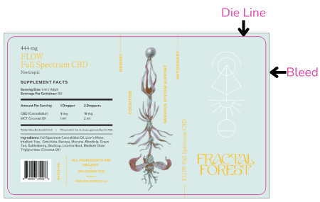
Bleed is a critical concept in print-ready art that ensures that the final printed piece looks polished and professional. The term bleed refers to the area of the design that extends beyond the trimmed edges of the printed piece. Here’s why bleed is essential:
- Trimming Tolerance: During the cutting process, slight variations can occur. Without bleed, there may be tiny white edges visible on the final printed piece where the design does not extend all the way to the trim edge.
- Edge-to-Edge Design: Including bleed ensures that your design extends to the very edges of the paper, creating a seamless and aesthetically pleasing appearance.
At Columbine Label, a bleed of .0625 inches is standard for most print projects. This additional space allows for trimming variations while maintaining a consistent, edge-to-edge design.
Safe Zone: Protecting Vital Information
While bleed ensures that your design extends to the edges, the safe zone is the interior area of your artwork where you should keep essential elements. These vital elements include text, logos, and other critical information that you want to ensure remains within the printed piece.
The safe zone for labels printed by Columbine Label extends about .0625″ inches from the trim edge inward. By keeping crucial content within this area, you reduce the risk of it being accidentally trimmed off during the printing process.

Die Line: Defining the Shape
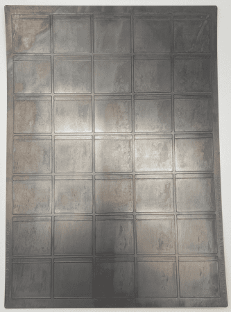
First, what is a die? A die is a piece of metal that is used to cut the label into the correct shape, but not cut through the liner behind the label. Die lines are guides in
the art that define the shape and dimensions of your printed piece. They indicate where the final product will be cut.
Here are some key points about die lines:
- Custom Shapes: Die lines are especially important when your project involves non-standard shapes or intricate cuts. They ensure that the final piece matches your intended design.
- Precision: Accuracy in die lines is paramount. Even slight misalignment can result in a product that looks unprofessional.
When creating print-ready art for projects with die lines, it’s essential to collaborate closely with your printer or manufacturer to ensure the die lines are accurately represented in your artwork.
The Importance of Resolution: 300 PPI
Resolution refers to the level of detail and clarity in an image or design. In the context of print-ready art, resolution is measured in pixels per inch (PPI). The standard resolution for print-ready art is 300 PPI. Here’s why resolution matters:
- Print Clarity: Higher resolution images and graphics result in sharper and more detailed print outputs. When printing text or intricate designs, a higher resolution ensures that fine lines and small text remain legible.
- Avoiding Pixelation: Insufficient resolution can lead to pixelation, where individual pixels become visible, causing a blurry or jagged appearance.
When creating print-ready art, it’s essential to use high-resolution images and graphics, especially for large-format printing or materials where fine details are crucial.
White Layer: Adding Versatility to Print
A white layer, also known as a white ink layer, is a design element used to introduce opacity or a white base to specific areas of your artwork. This technique is particularly useful when printing on colored, metallic, or transparent materials.
Here are some scenarios where a white layer is important:
- Printing on Transparent, Metallic or Dark Substrates: When printing on materials like clear plastic, metallic BOPP or colored paper, a white layer is used as a base to ensure that colors appear vibrant and true to your design.
- Highlighting Specific Areas: Designers can strategically apply a white layer to certain parts of the artwork to create contrast and make specific elements stand out.
By including a white layer in your print-ready art, you gain versatility and the ability to adapt your design to different materials and printing requirements. For help creating a white layer, follow our step by step guide on building a white layer.
Creating print-ready art is essential to ensuring that your design translates seamlessly from the digital realm to the physical world. Understanding the differences between CMYK and RGB, the importance of resolution (300 PPI), bleed, safe zones, die lines, and the significance of a white layer empowers designers to produce high-quality, professional, and visually striking printed materials. Collaborating closely with printers and manufacturers during the design process helps ensure that your vision is accurately brought to life in the final printed product. All of Columbine Labels art guidelines can be found on our Art Guidelines page.


