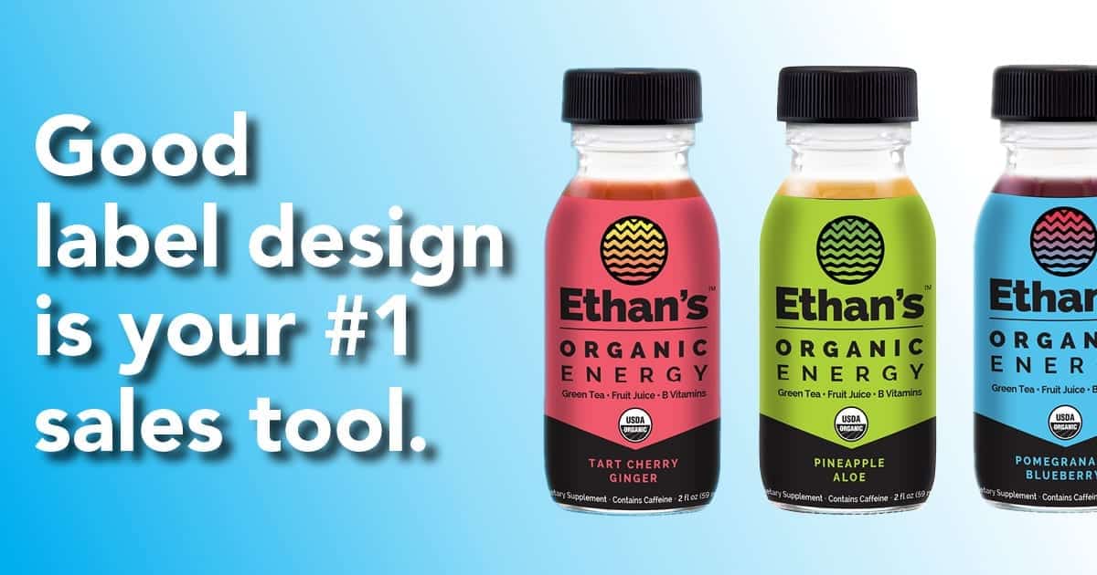
When it comes to a label, looks matter, and the stats prove it
In one study, 93 percent of consumers deemed a product’s visual appearance as the most important factor in their product purchase choices. Thus, label appearance has big implications. It is a primary driver of your revenue. When we effectively engage consumer minds – within mere seconds — the dollars follow. So it is important to reverse engineer “label appearance” and understand what truly engages – and potentially disengages — consumers.
Let’s take a look at the five most compelling tips for creating engaging label designs.
Tip 1. Get Organized
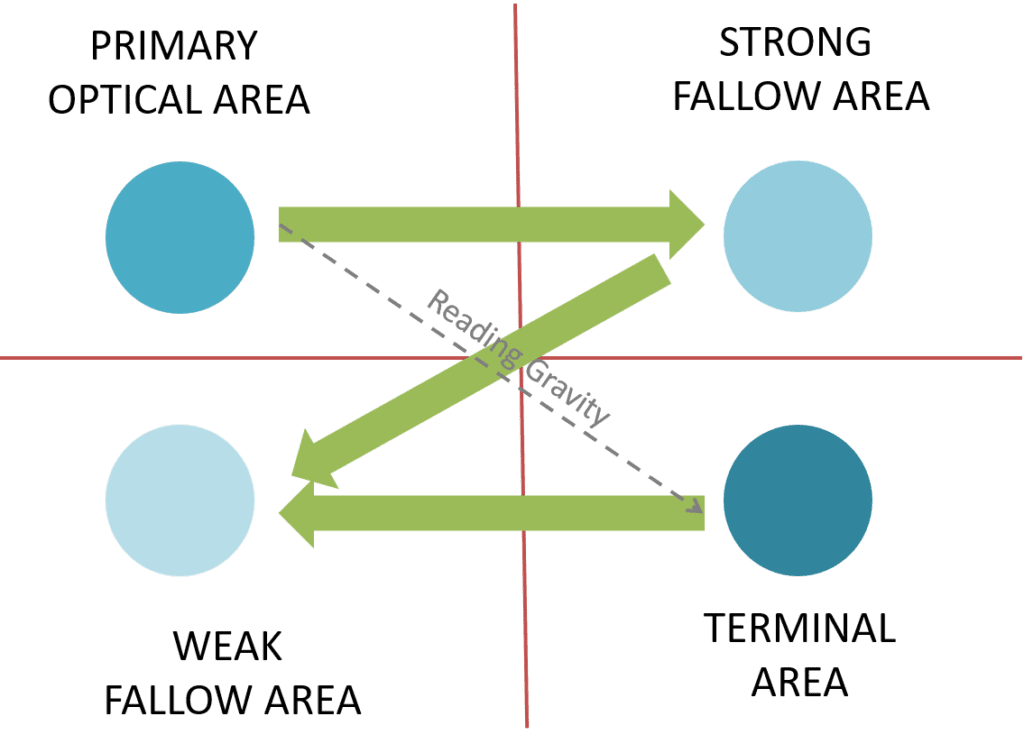
Organizing a label design is a must-needed initial step. Our brains scan information in specific patterns, known as the Gutenberg rule or Z-pattern of processing. In order to create an engaging order of information, it’s helpful to understand how the human eye and brain view information.

Based on the Gutenberg pattern shown above, the eye will sweep across and down a label or page in a diagonal pattern from the primary optical area to the terminal area. That diagonal is known as reading gravity. For prime labels, a helpful rule of thumb is to strategically place key information within this pattern to help maximize customer engagement.
Tip 2. Information Underload
Knowing the primary label areas to populate with your most important information is helpful for design. However, it is essential to resist overpopulating the label design, in all areas, with too much information. The goal is “information underload”, to prevent overwhelming and disengaging consumers. A good rule of thumb is to limit key points and messages: a minimum of 3 and a maximum of 7 for each viewable section of the label.
Tip 3. Images Engage
Given the talented designers that craft labels, it’s no secret that pictures and images are powerful influencers on the path to purchase. Using high-impact and highly relevant images taps into consumers’ emotions and can instantaneously create a connection with a product – or not. Thus, selecting appropriate imagery that is not overly complex, in design and colors, goes a long way in helping to communicate and connect with consumers who are making split-second decisions on which product to pick up and purchase.
In imagery, a good rule of thumb is to start with your customer in mind and design graphics from the customer’s perspective vs. from your company’s perspective.
Tip 4. Less is More
As the famed Renaissance artist Leonardo DaVinci said, “simplicity is the ultimate sophistication.” In label design, that rings very true. Having the design discipline to intentionally minimize font choices, font weights, and limit lines of text is a good practice. An overcrowded, overly complex label can readily become an ignored label.
A recommended rule of thumb is to employ two fonts, averaging seven words per line and using a maximum of three lines of text before a spacing break.
Tip 5. Function Matters
In label design, the functionality of the label is an important and oft-overlooked component of visual appearance. On store shelves, edge-lifts are an absolute no. As are crooked or un-centered labels, which the eye can unconsciously detect and process as substandard product quality. And of course, the print quality of the label, including colors, print registration, and label-to-label consistency is of paramount importance to visual appearance and appeal.
A tried-and-true rule of thumb is to partner with a label supplier who obsesses about quality on multiple levels and for each and every order so that your product presents its’ most beautiful face on the store shelf.
Using these five tips as label design guideposts can help ensure your labels engage consumers, boost preference for your products and ultimately help drive your revenue.


