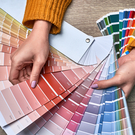
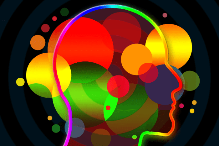
Every detail matters in the world of marketing and product design. From the shape of a bottle to the choice of words in an advertisement, businesses use various strategies to capture the attention of consumers and create lasting impressions. One of the most powerful tools in a designer’s arsenal is color. Color psychology plays a crucial role in product label design, influencing consumers’ emotions, perceptions, and ultimately, their purchasing decisions. In this blog, we’ll explore the fascinating world of color psychology and its application in custom product labels.
Understanding Color Psychology
Color psychology is the study of how colors influence human behavior and emotions. It’s a field that delves into the psychological and emotional responses people have to different colors. These responses are not universal; they can vary greatly across cultures and individuals. Nevertheless, certain colors tend to evoke some common associations and emotions, making them valuable tools for designers.

- Red: Passion and Excitement
- Red is a color associated with energy, passion, and excitement. It’s known to increase heart rate and stimulate appetite.
- In product label design, red is often used for products that want to create a sense of urgency or passion, such as energy drinks or spicy foods.
- Blue: Trust and Serenity
- Blue is often associated with trust, calmness, and reliability. It can also evoke feelings of security and stability.
- Products that aim to convey trustworthiness, like banks or tech companies, often use blue in their branding and label design.
- Yellow: Optimism and Cheerfulness
- Yellow is a color that exudes optimism and cheerfulness. It’s known to stimulate mental activity and create a sense of happiness.
- Many food products, especially snacks and candies, use yellow in their labels to convey a sense of joy and delight.
- Green: Nature and Freshness
- Green is strongly associated with nature, growth, and freshness. It often symbolizes health and wellness.
- Organic and eco-friendly products often incorporate green into their label design to emphasize their natural qualities.
- Black: Sophistication and Elegance
- Black is often linked to sophistication, elegance, and luxury. It can create a sense of exclusivity.
- High-end brands, like designer clothing and luxury cosmetics, frequently use black in their labels to convey a premium image.
- Purple: Creativity and Royalty
- Purple is associated with creativity, imagination, and royalty. It can be both calming and inspiring.
- Beauty products and artistic brands often use purple in their label design to evoke a sense of creativity and luxury.
- Orange: Energy and Warmth
- Orange is a color that radiates energy, warmth, and enthusiasm. It’s often seen as friendly and approachable.
- Products aimed at a young and vibrant audience often use orange in their labels to connect with these qualities.
- Pink: Femininity and Playfulness
- Pink is commonly associated with femininity, playfulness, and tenderness. It can evoke feelings of affection and warmth.
- Products targeting a predominantly female audience, such as cosmetics or fashion, often use pink in their label design.
For an even more in depth analysis of colors and hues check out Colorpsychology.org
Applying Color Psychology in Product Label Design
Now that we have a basic understanding of the emotions and associations linked to various colors, let’s explore how this knowledge can be applied in product label design.
- Target Audience Analysis: Before selecting colors for a product label, it’s crucial to understand the target audience’s preferences and emotions. For example, if you are designing a label for a children’s toy, bright and playful colors like red, yellow, or blue may be appropriate. In contrast, a label for a high-end perfume might benefit from a more subdued color palette, like black and gold.
- Brand Identity: Consider the personality and values of your brand. The chosen colors should align with your brand’s identity. For instance, if your brand promotes eco-friendliness and sustainability, green or earthy tones would be a good fit.
- Color Combinations: It’s not just about the individual color but also how colors interact with each other. Complementary or harmonious color schemes can make a label more visually appealing. Analogous colors (colors next to each other on the color wheel) can create a sense of unity, while complementary colors (opposite on the color wheel) can provide contrast and excitement.
- Contrast and Readability: Ensure that the text on your label is easily readable. High contrast between the background color and text color is essential for legibility. For example, white text on a dark background or vice versa is a classic choice.
- Cultural Considerations: Be aware of cultural differences in color symbolism. Colors can have vastly different meanings in various cultures. For example, white symbolizes purity in Western cultures but is associated with mourning in some Asian cultures. Avoid using colors that may be offensive or misinterpreted in your target market.
- Emotional Impact: Think about the emotional response you want to evoke. If you’re marketing a relaxation beverage, soothing colors like blue and green would be more appropriate than vibrant reds or oranges. Conversely, a label for an adrenaline-pumping sports drink might benefit from energetic colors.
Case Studies
Let’s examine a few real-world examples of how color psychology has been applied in product label design to great effect:
- Coca-Cola:
- Coca-Cola’s iconic red label is synonymous with energy and excitement. The brand has successfully associated its product with joy and celebration through its consistent use of red.
- Apple:
- Apple’s minimalist design ethos often features a clean, white background with sleek metallic accents. This choice of colors conveys simplicity, sophistication, and innovation.
- Whole Foods Market:
- Whole Foods uses a predominantly green color scheme to emphasize its commitment to organic and natural products. This choice aligns with consumers’ expectations for healthy and eco-conscious choices.
- Tiffany & Co.:
- The luxurious Tiffany Blue is instantly recognizable and associated with elegance and high-end jewelry. The color is so iconic that it’s even protected by trademark.
- Dove:
- Dove, a brand known for its skincare products, employs soft and gentle shades of white and pastel colors in its label design. This choice reflects the brand’s commitment to nurturing and caring for the skin.
Color psychology is a powerful tool in product label design. When used effectively, it can influence consumers’ emotions, perceptions, and purchasing decisions. By carefully considering the target audience, brand identity, and cultural factors, designers can create labels that not only look appealing but also convey the desired message and emotion.
As you venture into the world of product label design, remember that the choice of colors is just one piece of the puzzle. It should work in harmony with other design elements and the overall brand strategy. When executed thoughtfully, color psychology can enhance the visual impact of your product label and leave a lasting impression on consumers. Now that you have your colors selected make sure to follow these art guidelines to ensure that your product labels are ready to print! If you don’t have them chosen yet, then fear not, we have more inspiration. See our articles on prime labels and how the process works for producing custom printed labels.


