3 ways to create showstopper labels that help online product sales
Humans are visual beings. That’s why an ad featuring a juicy hamburger makes our mouth water, photos of puppies make us smile, and a sunny tropical beach image makes us long for a vacation. It’s downright scientific: 90 percent of information transmitted to our brain is visual. What’s more, 93 percent of consumers say appearance is the key deciding factor in a decision to buy.
Virtual is visual
That visual influence is no different in a virtual environment. Even more so, actually. That’s because digital channels, unlike in-store experiences, are one-dimensional. You can’t feel, smell or hear a product firsthand. This puts even greater importance – and burden – on the visuals of your packaging and label to do all the heavy lifting.
That is why there is one axiom that consumer packaged goods brands absolutely must heed in order to succeed online: your package and product label must be able to attract consumers, convey your brand story, and motivate a sale in a one-dimensional virtual setting, all in mere seconds.
3 ways to make your labels stand tall online
Making your product stand out (and sell out) doesn’t need to be complicated or even expensive. Instead, focus on these three things:
1. Create simple, yet inspiring and innovative, designs
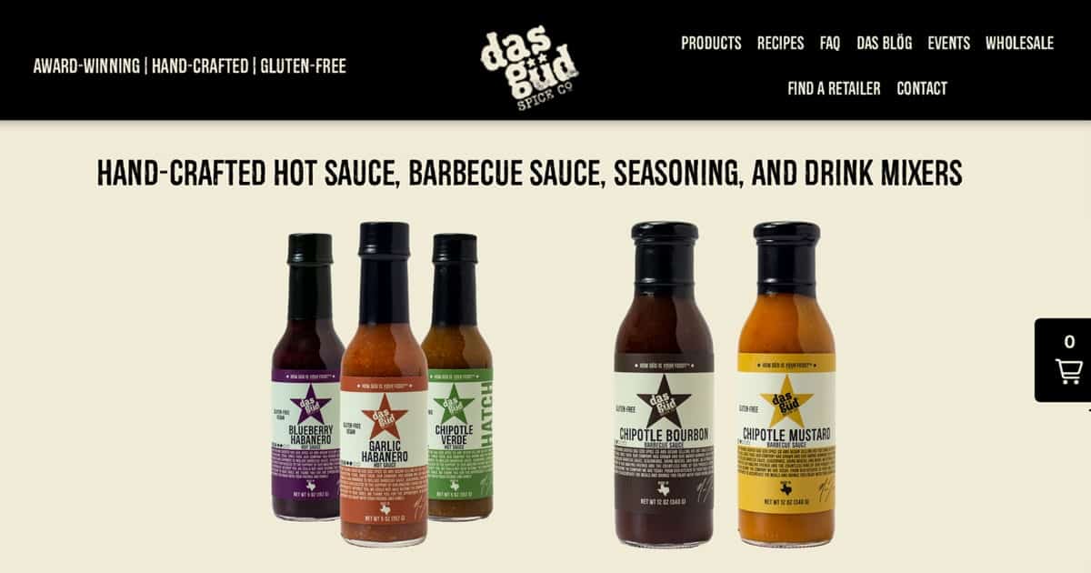
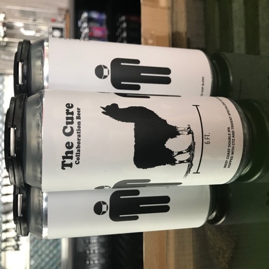
In a world of online shopping, simplicity rules. Label designs should be clean and clear to quickly convey to shoppers what your product is and who you are. Minimalism, white space, and easy-to-read fonts are trending for that very reason. Color and innovation also attract buying eyes.
2. Use professional photos
Once you’ve invested in the right packaging and eye-catching label designs, do your product(s) justice with photos taken professionally. Professional photos provide the right lighting, camera angles, color, and quality resolution you need to showcase your products online. It can pay off, too. Research shows that 47 percent of online consumers in the U.S. rate high-quality product photos as the most influential factor when considering a purchase from a specific brand. And if you can help it, don’t stop at just one photo. This research further reveals that half of U.S. online shoppers prefer to see at least three to five photos (front, back, side) before buying.
Depending on your product, market, or industry, you can present your product(s) in photos in one of two ways: product-only and in-context.
Product-only photos are just that. They feature your product on a simple, usually white, background. Here, your product label is truly the star and salesman. This style works well on web product pages and is known to generate a significantly higher rate of conversion.
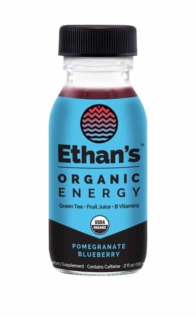
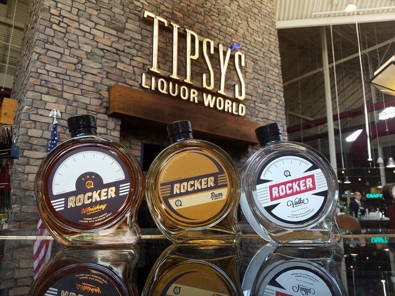
In-context photos show your product in use or in an interesting setting. This photo style is ideal for conveying your brand lifestyle and telling your brand story. In-context photos that feature your product can help create an emotional connection with customers, vital to converting browsers to buyers. These can be used in conjunction with product-only for visual variety and enhanced storytelling.
3. Build out your brand
Your products online are a direct extension of your brand. Build on your brand by being consistent. Use the same logo, color palette, graphics, and messaging in all marketing assets across all channels. This makes it easier for shoppers and potential buyers instantly recognize your product when searching online.
Bottom line: leverage your label
Whether consumers are eyeing your product online or in-store, your label is still your best brand ambassador. Successful brands leverage exceptional labeling and packaging to attract and motivate buyers to click or pick you.
