RGB and CMYK What’s the Difference and Why Does it Matter?
Color is an essential aspect of any design. It is critical to understand the differences between RGB and CMYK color modes for producing high-quality prints. RGB and CMYK are two different color modes used in graphic design and printing. In this blog post, we’ll discuss the differences between the two and the importance of a color bridge for bringing your design off the screen and into print media.
RGB and CMYK Color Modes
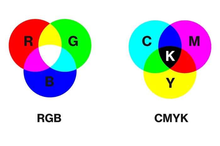
RGB stands for Red, Green, and Blue. This color mode is used for digital designs that will be displayed on screens such as computers, tablets, and smartphones. In RGB mode, colors are created by mixing varying amounts of red, green, and blue light. This mode is capable of producing a wide range of bright, vibrant colors, making it ideal for digital designs.
On the other hand, CMYK stands for Cyan, Magenta, Yellow, and Key (Black), and it’s a color mode used in printing. In CMYK mode, colors are created by combining varying amounts of cyan, magenta, yellow, and black ink. This mode is best suited for printing purposes, as it can reproduce a wide range of colors on print media such as paper or BOPP.
When designing for print, it’s essential to work in CMYK mode to ensure that the colors you see on the screen will match the printed version. RGB colors can appear brighter and more vibrant on screen than they do in print. This happens because the RGB color strategy uses light, and the CMYK color strategy uses pigments. When you mix the three colors of light, RGB, together white light is the resulting color. Mixing the four printing pigments, CMYK, together the resulting color is black. Going from mixing light to mixing color isn’t an exact 1 to 1 change. Converting to CMYK mode during the design process for any design destined for print can help you achieve the desired color accuracy.
Color Bridge

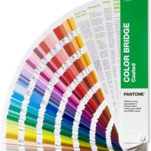
Designing in CYMK is the best option for print. If that isn’t possible or the design was already created in RGB, a color bridge can help determine how the printed design will look. A color bridge is a guide produced by Pantone, that shows how colors designed in RGB will appear when printed using CMYK. It’s a valuable tool, as it allows for comparing colors in RGB mode to their closest equivalent in CMYK mode. This helps to get a close estimation of how colors will appear when printed.
Colors designed in RGB mode can’t always be accurately reproduced in CMYK print. So, color bridges are used to “bridge the gap” between the colors displayed on screen and the printed colors. The color bridge guide shows how each RGB color will appear when printed in CMYK mode. This makes it easier to adjust the color values to ensure the best possible match between the two.
Graphic design and printing use RGB and CMYK color modes. RGB is best for digital designs, while CMYK is best for printing. It’s essential to work in CMYK mode and use a color bridge when designing for print, so that colors will appear accurately.
To learn more about color modes Adobe does a great job explaining and describing how to convert between color modes.
To learn more about artwork requirements for a seamless printing experience visit our Resource Center: Art Guidelines


