Printed Borders on Labels: A Design Risk Worth Rethinking
In the world of product packaging, where first impressions often determine whether a consumer reaches for your product or passes it by, label design is an essential part of your brand’s visual identity. Color, typography, shape, material—all these choices play a role. But one design element frequently chosen for its aesthetic appeal can also become a technical challenge: printed borders.
Though seemingly harmless, borders are often the first thing to “go wrong” in the label printing and finishing process—not because of poor craftsmanship, but due to the unavoidable physical tolerances that come with die cutting and registration. A crisp border may look fantastic on a computer screen, but once that label is printed and die-cut at high speeds, small shifts can turn a clean design into something that looks off, crooked, or cheap.
In this article, we’ll break down:
Why printed borders are a technical challenge
The role of die-cutting tolerances
How the human eye interprets alignment
Real-world consequences for brand perception
Design alternatives that avoid the pitfalls of borders
Why Printed Borders Create Problems in Label Printing
Borders are often used to create structure in a design. They can frame logos or product names, define spaces, or add visual sophistication. But they also demand precise alignment, and that’s where the trouble begins.
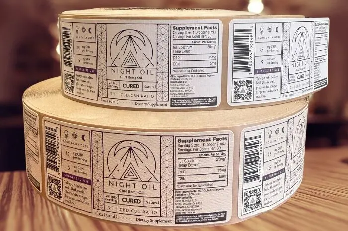
Let’s take a common scenario: a rectangular label with a black border running 1/8″ inside the edge. If that border is even slightly misaligned—off by even a fraction of a millimeter—it becomes instantly noticeable. The top border might look thicker than the bottom, or the left side thinner than the right. Suddenly, what was meant to create structure now makes the label look poorly printed or even off-center, despite all mechanical processes being within acceptable limits.
This issue is not usually caused by poor printing or bad cutting. It’s caused by a reality that every experienced printer knows well: mechanical tolerance.
Understanding Die-Cutting Tolerances
Every mechanical process has a tolerance—a range within which results may vary, even when everything is functioning properly. In label printing and die cutting, this tolerance is typically ±0.0625 inches, depending on the equipment, material, and complexity of the job. That means your label’s cut can shift up to 1/16th of an inch in any direction and still be considered within spec.
To most industries, this is incredibly precise. But when you have a label with a border that’s only 1/16″ thick, that same shift is enough to make one side of the border appear twice as thick as the other.
Even worse, most die-cutting is done in high-speed environments. Labels are produced in the tens or hundreds of thousands per hour, and even slight environmental changes—temperature, humidity, material tension—can affect registration. In this context, a border becomes a visual microscope, exaggerating the perception of misalignment.
The Human Eye and the Illusion of Misalignment
Part of the problem isn’t just mechanical—it’s psychological.
The human visual system is incredibly sensitive to asymmetry, especially in geometric shapes. This evolutionary quirk once helped us detect predators in the brush; today, it makes us acutely aware when a product label looks just a little “off.” We may not be able to say why it looks off—we just know something isn’t right.
This perceptual sensitivity means that:
A centered logo that’s 0.01″ off still appears fine.
But a border that’s off by the same amount looks dramatically wrong.
Our brains use borders as reference points. When a border isn’t symmetrical, we interpret it as a mistake—even if the rest of the label is perfectly aligned.
This sensitivity is why printed borders aren’t just a minor risk—they can trigger disproportionate dissatisfaction in both brand owners and consumers.
Customer Perception and Brand Consequences
When a label has visible inconsistencies—like a lopsided border—it’s not just a printing issue. It becomes a brand issue.
Consumers may see:
A crooked border and assume poor quality control
Inconsistency across products and perceive lower brand value
Off-center packaging and infer the product inside is unreliable
None of this may be true. But perception is reality in branding, and packaging mistakes—even when technically minor—can erode trust. Worse yet, label buyers may receive a large run of product, see the border issue, and assume it’s a production defect, initiating returns or reprints that cost everyone time and money.
Designer Expectations vs. Production Realities
Graphic designers often create labels in digital environments where precision is absolute. A rectangle drawn in Adobe Illustrator is perfect; the border is always exactly where it’s supposed to be. Unfortunately, that perfection doesn’t translate to the physical world of flexographic or digital printing.
This disconnect can lead to friction between designers and production teams. Designers may feel their work is being compromised, while printers know that trying to “fix” the issue often leads to more trouble. Re-cutting a job to make a border appear centered often creates new registration issues elsewhere on the label.
That’s why it’s so important to bridge this gap during the design process—not after the job hits the press.
What Are the Alternatives to Printed Borders?
Luckily, there are several design strategies that retain visual sophistication without the technical headaches of printed borders.
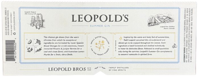
1. Bleeds Instead of Borders
Instead of using an interior border, consider extending your design elements all the way to the edge of the label—a technique called a bleed. This ensures that even if the die cuts are slightly off, there’s no hard edge to visually compare the cut against. The result looks cleaner and more consistent.
2. Move the Border in
Borders that are closer to the edge of the label will have more of an illusion of misalignment than borders that are further away from the edge. Often this minor design change can make a world of difference when looking at your final product.
3. Use Soft, Gradient Edges
Borders tend to be harsh and geometric, which draws the eye. But soft transitions or gradient fades at the edge of the label can still create a framing effect without the same alignment sensitivity. A gradient fading into the background color of your container will disguise minor shifts.
4. Go Borderless
Designs that don’t rely on borders at all—especially minimal, modern aesthetics—are much more forgiving in production. Clean typography, negative space, and strong color contrast can create a compelling design without needing edge-framing at all.
5. Use Asymmetrical Design Intentionally
If your product or brand allows for a more modern or playful approach, intentional asymmetry can help sidestep the issue. When a label design is not built around symmetry, the consumer doesn’t expect everything to align perfectly—so slight variations are less jarring.
6. Incorporate Structural Borders Instead of Printed Ones
If your product allows it, use the shape of the label itself as a kind of border. Custom die shapes or label cuts can create visual framing through physical contours, rather than inked lines. These are still subject to the same cutting tolerances, but because they’re structural, they don’t create a visual “frame” the same way a printed line does.
When You Must Use a Border
Sometimes, a border is necessary. It might be a required part of a brand’s visual identity, or the label needs to match an older version that already includes one. In these cases, there are still a few best practices that can mitigate the risks:
Use wider borders: A border that’s 1/4″ thick is much more forgiving than one that’s 1/16″. The thicker the border, the less perceptible a 0.015″ shift becomes.
Create border illusions: Use patterns, shadows, or interior spacing techniques to simulate a border without relying on a harsh line.
Discuss tolerances with your label printer early: If you’re working with Columbine Label, we’ll help you understand exactly what’s possible with your material, shape, and production method before you go to press.
Ask for a press proof: This can help you evaluate whether the visual impact of a border misalignment is acceptable before the full run begins.
The Takeaway: Function Over Formality
In label design, the clean geometry of a border can be tempting. It looks sharp, professional, and helps organize information. But when applied to a product label, it often causes more problems than it solves. Borders don’t just expose cutting tolerances—they exaggerate them, turning what would otherwise be acceptable variations into glaring visual defects.
As a label converter, we see this play out time and time again. A designer creates a beautiful label with a narrow border. The press run is produced exactly within tolerance. Yet the final result doesn’t meet expectations because the eye interprets minor shifts as major flaws.
This is why we always recommend caution when incorporating borders into your label design. There are smarter ways to frame your content without creating a risk to your brand’s visual consistency.
How Columbine Label Can Help
At Columbine Label, we understand the balance between design and production. We’ve been helping clients navigate die-cutting tolerances, substrate behavior, and layout best practices for decades. If you’re in the design phase and considering a border, we’re happy to review your art and make recommendations that will reduce risk without sacrificing visual appeal.
Whether you’re producing small batches for a boutique brand or high-volume runs for a national product line, we bring both precision and partnership to the process. Let’s work together to create labels that look great—not just on screen, but in real life.
Ready to review your label design?Contact us today to schedule a design consultation or request a quote. Our team will help you avoid the common pitfalls—and ensure your final product reflects the quality your brand deserves.