


The Distinct Look of Natural Kraft Labels
Natural kraft labels are a unique label material category known for their earthy, rustic look and uncoated paper texture. Unlike standard paper labels, which are typically bright white or coated for a smooth, uniform finish, natural kraft labels have a warm brown tone and visible paper fibers that create a more organic, handmade aesthetic. This gives them a distinctive presence on packaging, making them popular for products that want to communicate sustainability, authenticity, or artisanal craftsmanship.
While kraft is technically a type of paper, it is produced differently from the white or coated papers commonly used for general product labeling. Kraft is made from unbleached pulp, resulting in a sturdier, more textured material with a natural color that is not printed or artificially achieved. This composition not only influences its look, but also the way inks interact with the surface, something that sets it apart from typical paper stocks.
Natural kraft labels are also distinct from wine stock labels. Wine stocks are generally textured, premium paper materials designed to convey elegance and work well with specialty finishes like embossing or foil stamping. They often have a bright or neutral base color to enhance fine detail in printing. In contrast, natural kraft’s darker background and organic surface texture give it a more casual, earthy appearance, and it is less about refined luxury and more about grounded, authentic branding.
This category is especially suited for brands that want their packaging to reflect eco-conscious values or to stand out in markets where natural, handmade, or farm-to-table aesthetics resonate with customers. From specialty foods and beverages to health, wellness, and craft goods, natural kraft labels provide a distinctive foundation for bold, minimalist, or vintage-inspired designs.
Natural Kraft Labels Known for Texture, Tone, and Timeless Appeal
Natural kraft labels bring a character and personality to packaging that other materials simply can’t replicate. Their rich brown tone and fibrous texture create an unmistakable visual presence that feels authentic and grounded. One of the most charming aspects of natural kraft is that it’s truly natural, the color isn’t artificially produced, which means there can be slight variations in shade from one batch of stock to the next. Rather than being a drawback, this subtle difference adds to the material’s appeal, reinforcing the idea of uniqueness and individuality in each run of labels.
These labels work beautifully across a range of design styles, from bold, high-contrast graphics to understated, minimalist layouts. The tonal warmth of kraft can make lighter inks, foils, and specialty finishes pop in unexpected ways, while its tactile surface adds an extra layer of dimension to the customer experience. Whether the goal is to evoke heritage craftsmanship, artisanal quality, or modern simplicity, natural kraft provides a distinctive foundation that complements and elevates the brand story.
In a retail environment where so many products fight for attention, natural kraft’s organic tone and texture stand out for their authenticity, making it a go-to choice for brands that value both visual impact and genuine character.

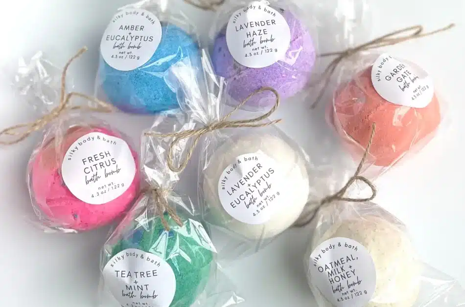
Distinctive Appearance
Natural kraft labels offer a warm brown tone with visible paper fibers, creating a handcrafted, rustic aesthetic that instantly sets products apart. This unique background color enhances minimalist designs and pairs well with bold, high contrast graphics.

Versatile Brand Positioning
The organic texture and neutral base of kraft complement a wide range of design styles from vintage and heritage-inspired branding to modern, minimalist packaging, making it a flexible choice for diverse industries and product lines.

Strong Visual Contrast
Kraft’s naturally darker background creates striking contrast when paired with lighter inks, metallic foils, or opaque whites. This contrast draws attention on crowded shelves and highlights design elements without overwhelming the product’s overall look.

Tactile Customer Appeal
The uncoated, textured surface of natural kraft labels adds a physical dimension to product packaging. This tactile quality invites customers to engage with the product, enhancing perceived quality and memorability in a competitive retail environment.
Get Your Natural Kraft Labels Today!
Our Commitment to You
Columbine Label isn’t just a label printing company — we’re problem solvers dedicated to helping you achieve your business goals. When you partner with us, we promise to deliver high-quality product labels every single time.
What You’ll Get With Every Honey Label Order
Use Columbine Label Company for _______

BOPP Labels
BOPP labels are durable, moisture-resistant, and ideal for products that face handling, refrigeration, or outdoor exposure. Their smooth surface delivers vibrant, long-lasting print quality, making them a versatile choice for food, beverage, personal care, and industrial applications.
Paper Labels
Paper stock labels offer a classic, cost-effective option for product packaging. They’re ideal for indoor use, providing excellent print quality and a natural feel that works beautifully for everything from food jars to boutique products.

Wine Stock Labels
Wine stock labels bring an elegant, textured look that elevates bottle presentation. Designed to convey sophistication, they offer excellent print quality and tactile appeal, making them a favorite for wineries and premium beverage brands.

Poly Films
Poly films for shrink sleeves and flexible packaging provide durability, vibrant print results, and a smooth finish. They conform seamlessly to unique container shapes, offering full-body branding and protection for products across food, beverage, and personal care industries.
Ready to Print Your Custom Natural Kraft Labels?
Gallery
Print Types


