Coca-Cola red has become one of the most recognizable colors synonymous with a specific brand in the history of marketing. That unvarying red has remained a color consistent with the Coca-Cola brand since Frank Robinson, the bookkeeper, and partner of its inventor, Dr. John Pemberton, developed the name, script logo, and color choice in 1886.
It just goes to show that 135 years later, color still matters. And color consistency is equally important when it comes to product labels and packaging. Consumers are trained to associate a certain look with a brand. Any deviation can erode that brand recognition—and loyalty. Coca-Cola didn’t become the behemoth brand that it is today by allowing its legendary red to shift over time. But achieving that repeatable consistency can be elusive.
The color problem(s)
Let’s say you print an initial set of product labels, and the color “looks” great. But with the next run, the color is a half-shade off, barely noticeable. Then let’s say you keep running reprints, but each time the color is off just a bit. By the tenth run, if you place a product with the first run label side-by-side with a product featuring a label from the last print run, it becomes obvious the color has shifted dramatically. This can affect consumer perception and buying behavior. The newer product might look older or inferior because the color is off.
This color drift dilemma is the number one problem in the printing industry.
The color consistency solution(s)
Fortunately, there are a number of steps purveyors of consumer-packaged goods can take in partnership with their custom label printing company to ensure that the brand’s color remains true and consistent from run to run.
-
-
Start with the proper design.
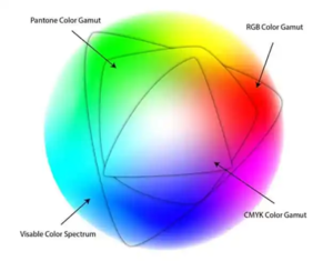
Labels designed using RGB colors look bright and vibrant on a computer monitor or other digital device. But they won’t—and can’t—be reproduced that way on a print press that uses CMYK inks. Label designs should be built with CMYK color layers, or 6-color CMYKOV if you’re trying to achieve a specific PMS color gamut.
-
Make print-friendly color choices.
Light background colors such as tan or beige can be challenging to match and hold in a CMYK color build. PMS greens and purples also prove tricky to match in CMYK. And those bar codes? Use black ink only, not a CMYK build which can interfere with proper scanning.
-
-
Consider the label material.
If you choose a silver or clear substrate, add a layer of white under the color build to create greater opacity and ensure that the colors pop.
-
Provide your printer with a sample.
If you have previously printed your labels, provide your label print provider with a sample so they have a reference to match against.
-
Look to your printer’s expertise.
A reputable custom product label printer will keep a record of every print run, including the print specs and color profile for a specific press. This is used as the consistent starting point for each run to prevent the dreaded color drift and ensure that every run matches the first one.

-
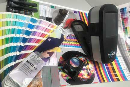
Follow the reliable color science.
While color perception is admittedly subjective, color can indeed be measured by an instrument called a spectrophotometer. Colors are measured in much the same way GPS addresses are used: every color has specific coordinates. It’s nearly impossible to exactly duplicate color every time, but these coordinates measure an acceptable objective range. The use of a spectrophotometer during the print process enables press operators to aim for the smallest possible color shift the human eye can detect and develop a consistently repeatable standard.
-
Stick with one print provider, if possible.
Different printers operate different presses, color profiles, and prepress operators. Labels that one printer produces will most likely not match that of another print provider. If color consistency is a top priority, a single custom label printer is one of the surest ways to lock it on.
Additional color QC measures don’t end there. Every person at a print shop that touches a label—from prepress and press operators to die-cutting, rewinding, shipping, and even invoicing—has the ability and the responsibility to accept or reject a job if the colors don’t meet the highest of standards.
Ask the experts
“Color is my day-long obsession, joy, and torment,” Claude Monet once said. We couldn’t agree more. Columbine Label Company is dedicated to helping you take the guesswork out of color matching and color consistency for your custom product labels. Contact us for a free consultation.